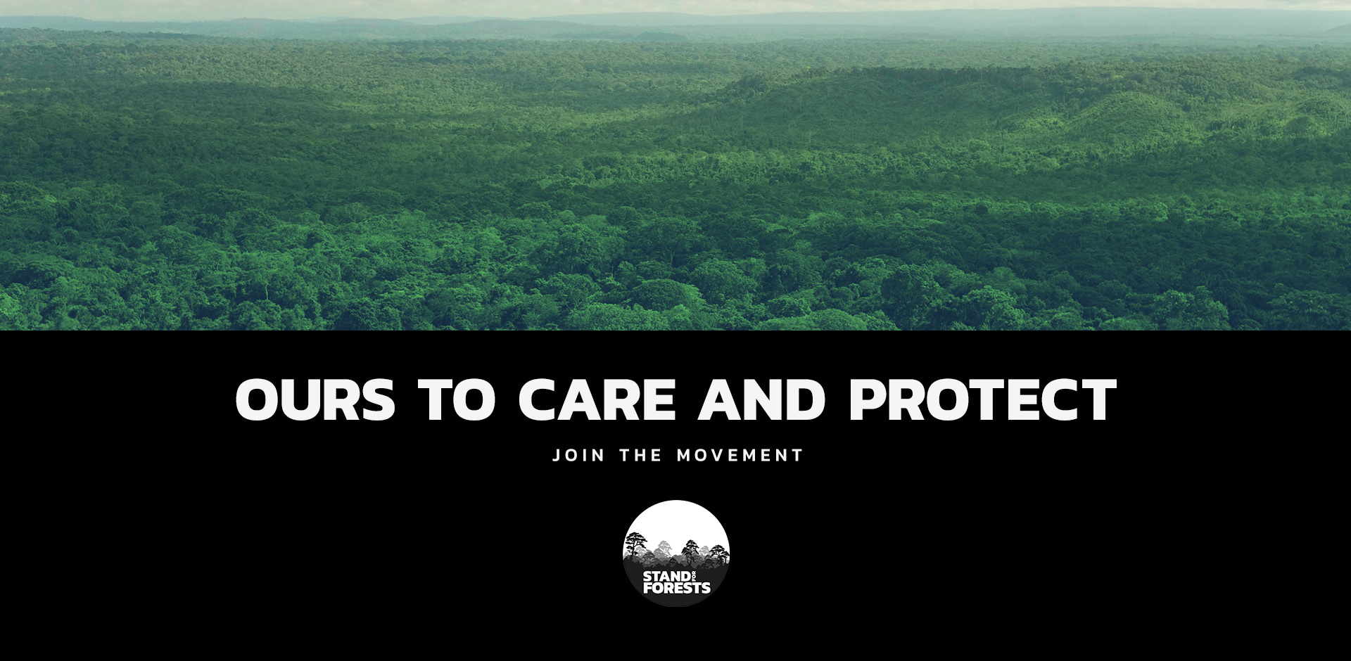
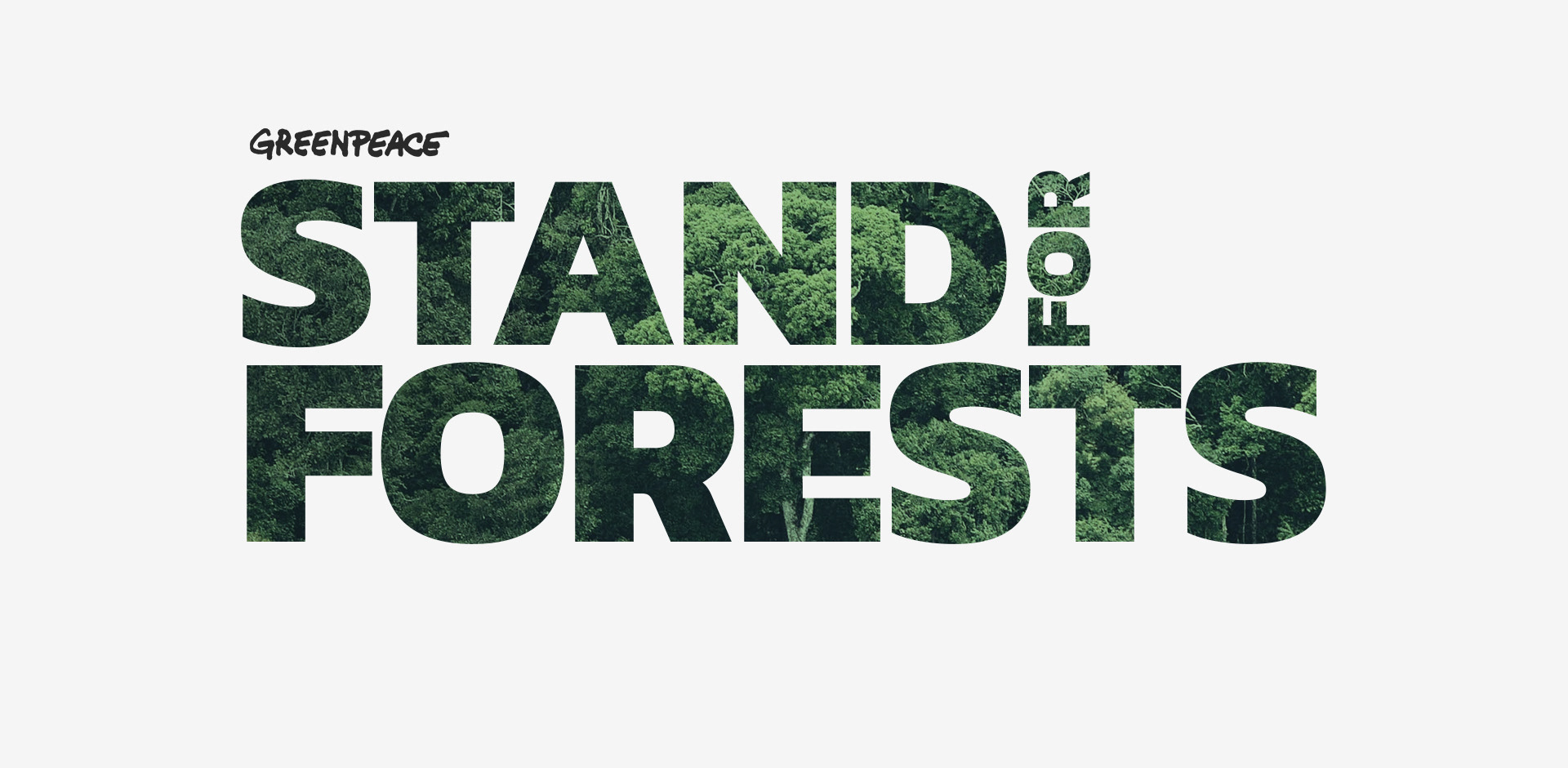
Stand For Forests | Greenpeace
Global Campaign Style Guide & Logo Development studies
Art Direction & Design: Omer Avarkan | Project Lead: Asli Sonceley
Additional Iconography: Kristen Abercrombie | Client: Greenpeace
Studio: Fake Crow | Los Angeles | Date: 2016
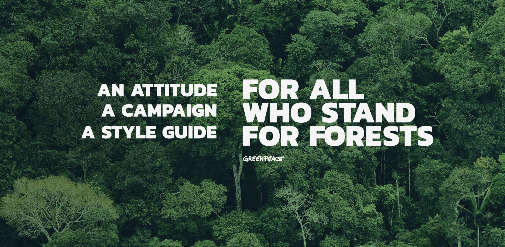
An Insight On The Project
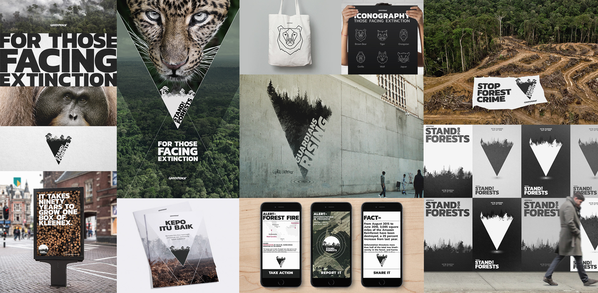
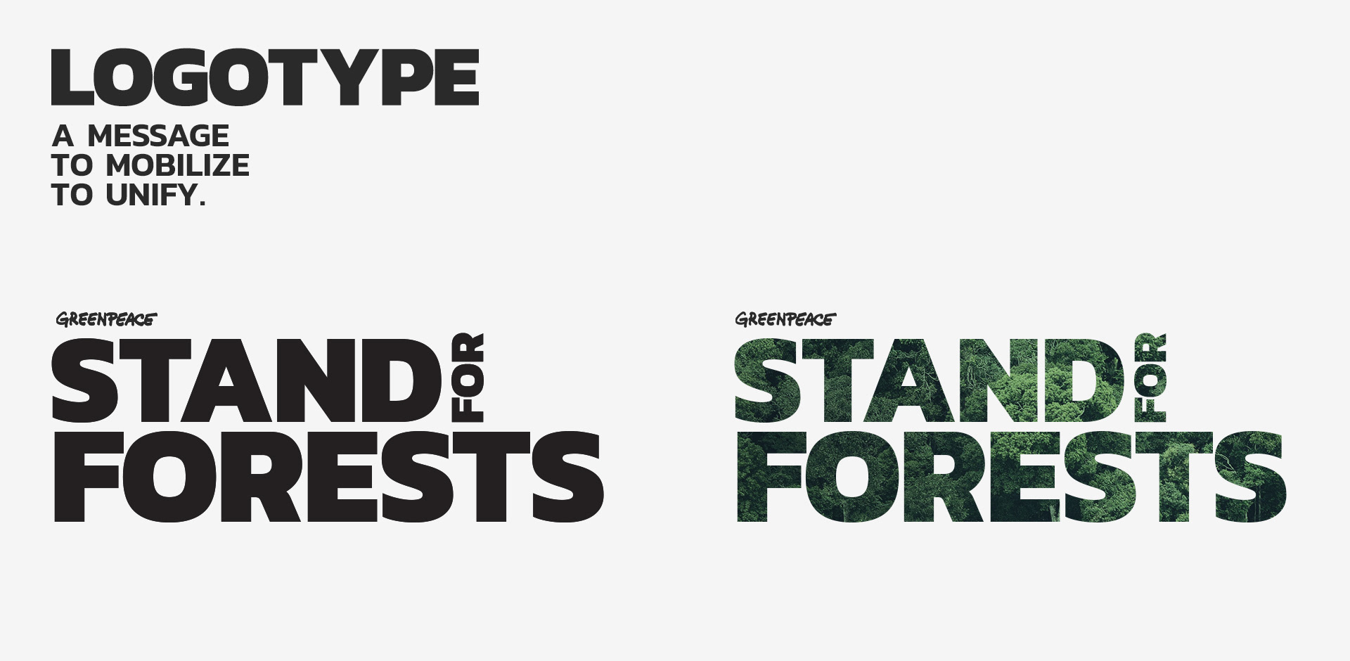
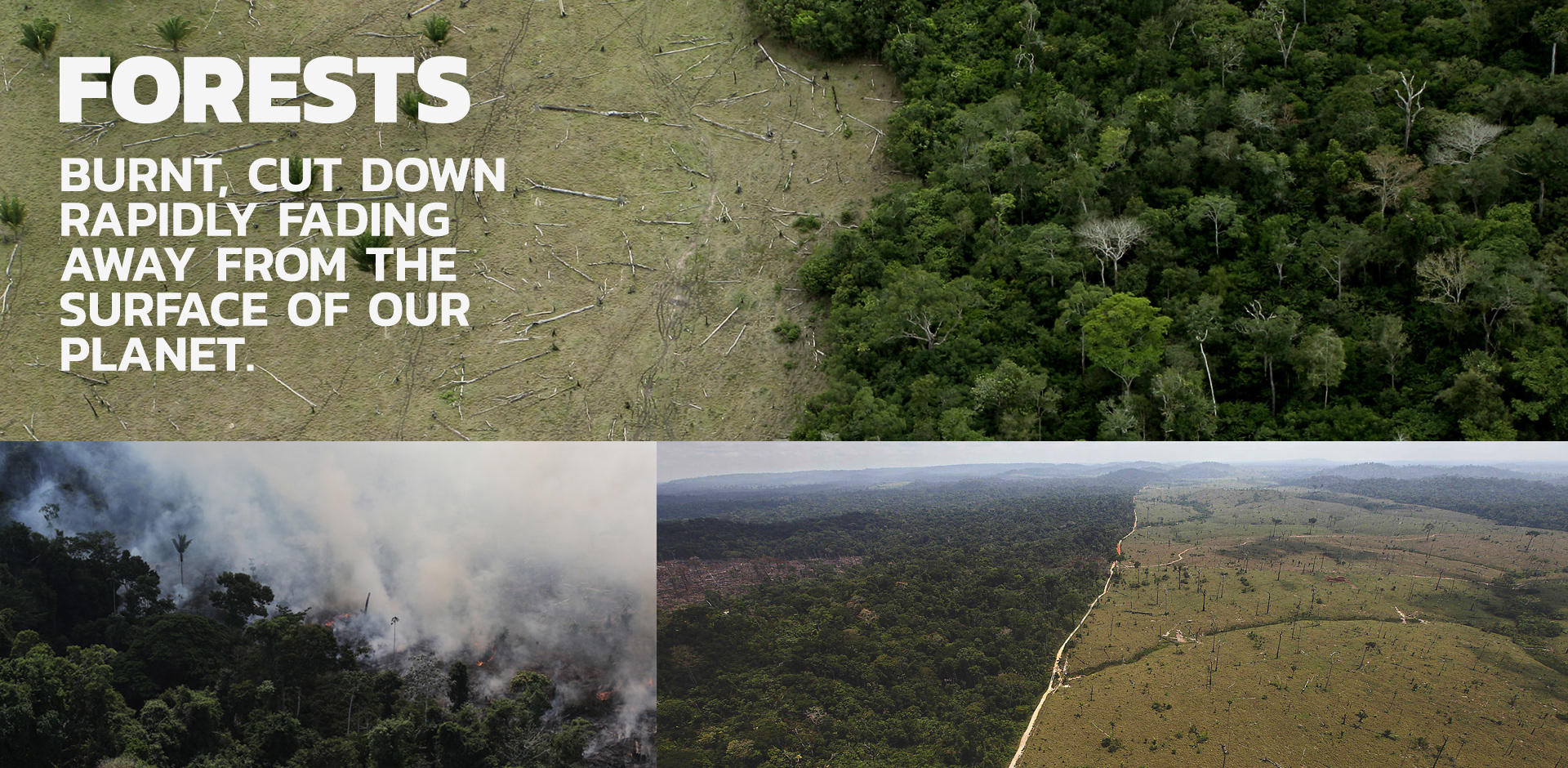
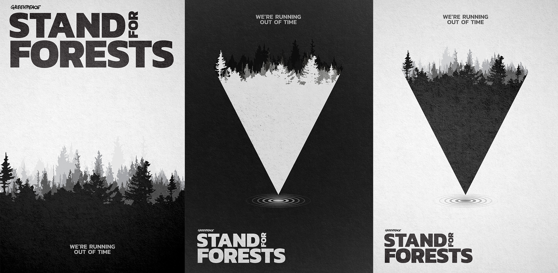
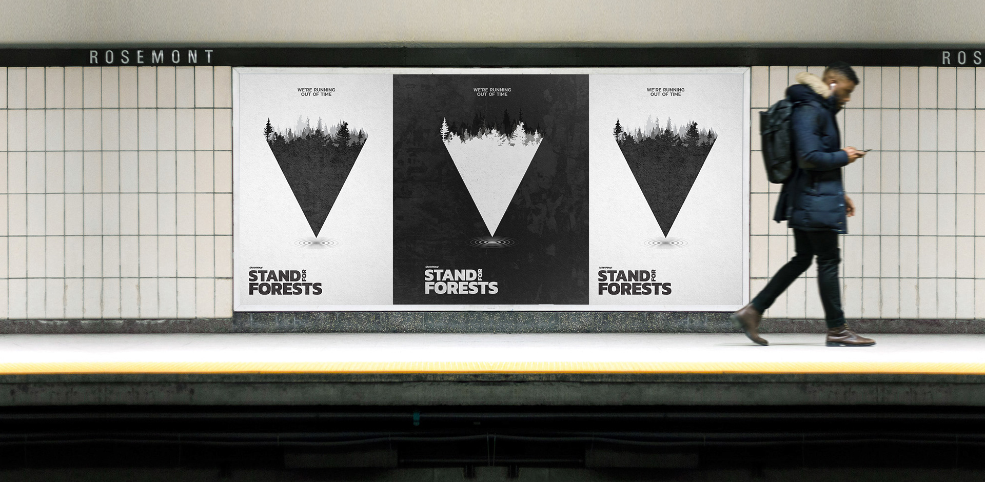
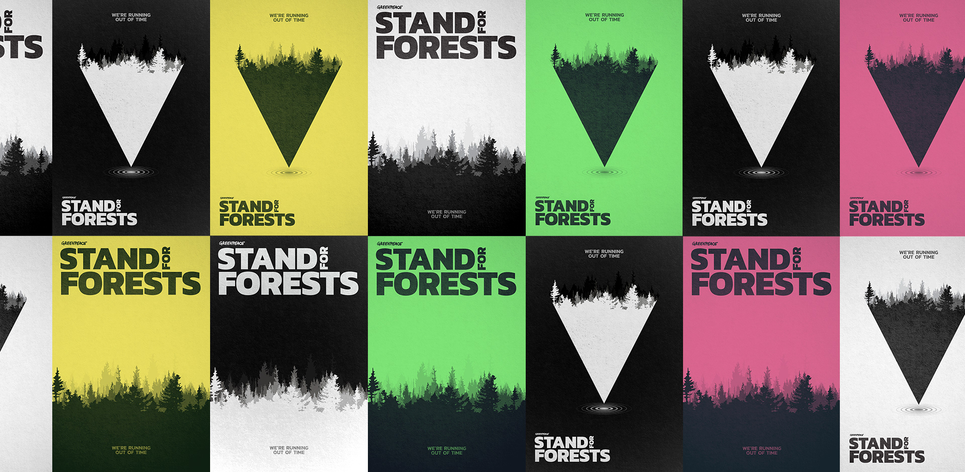
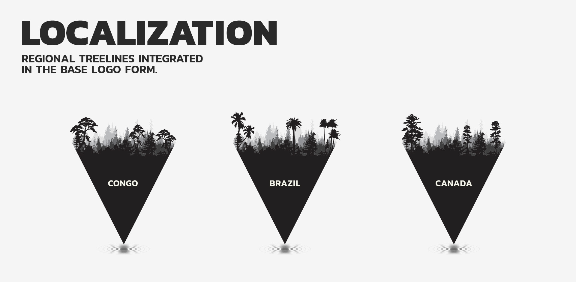
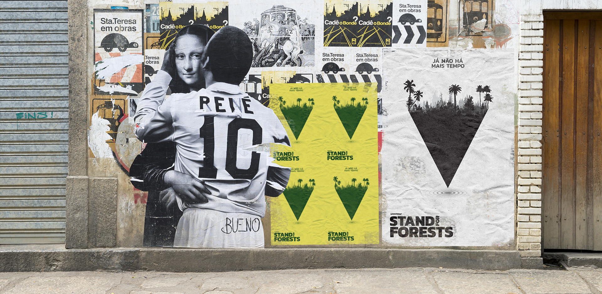
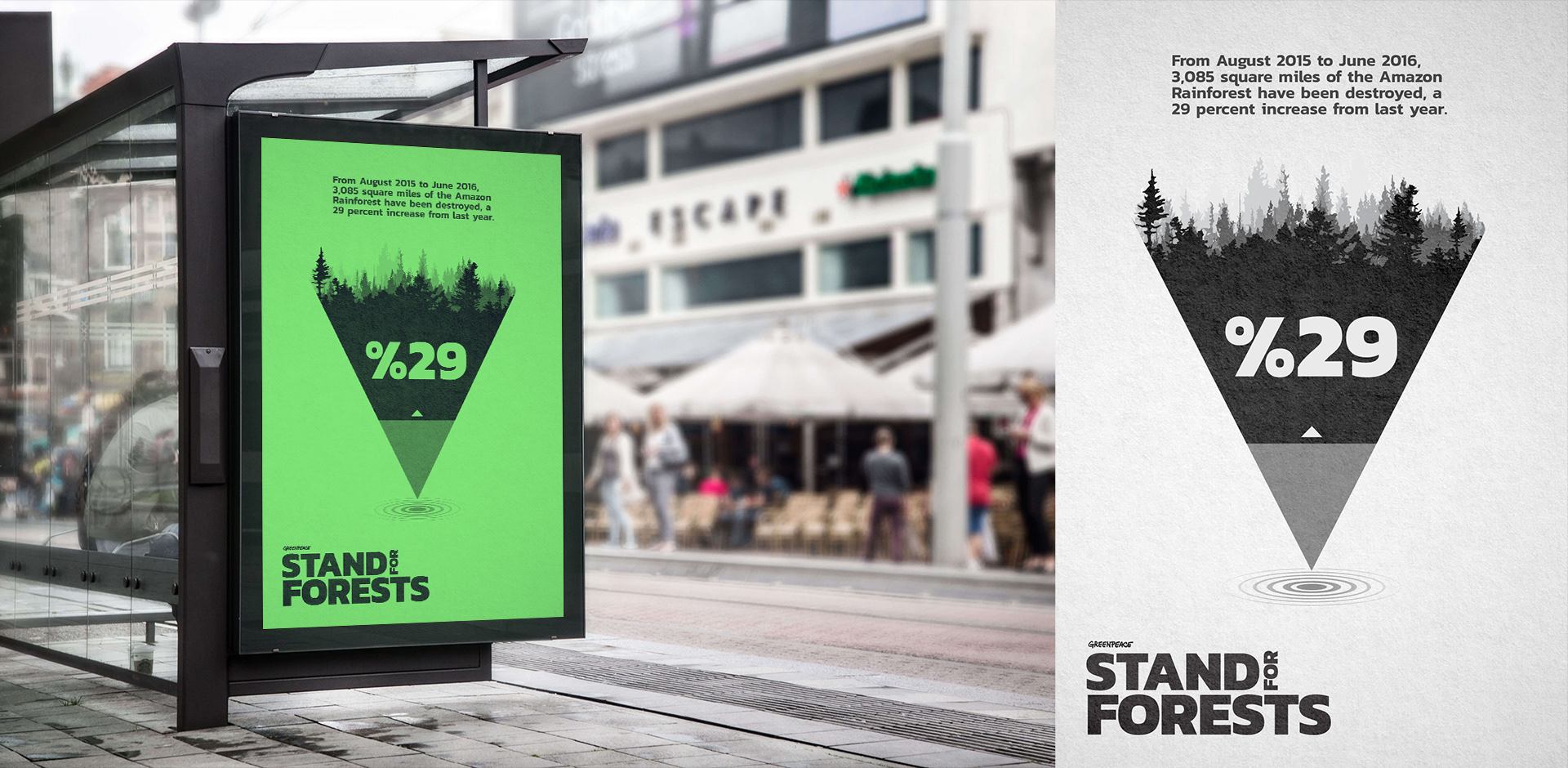
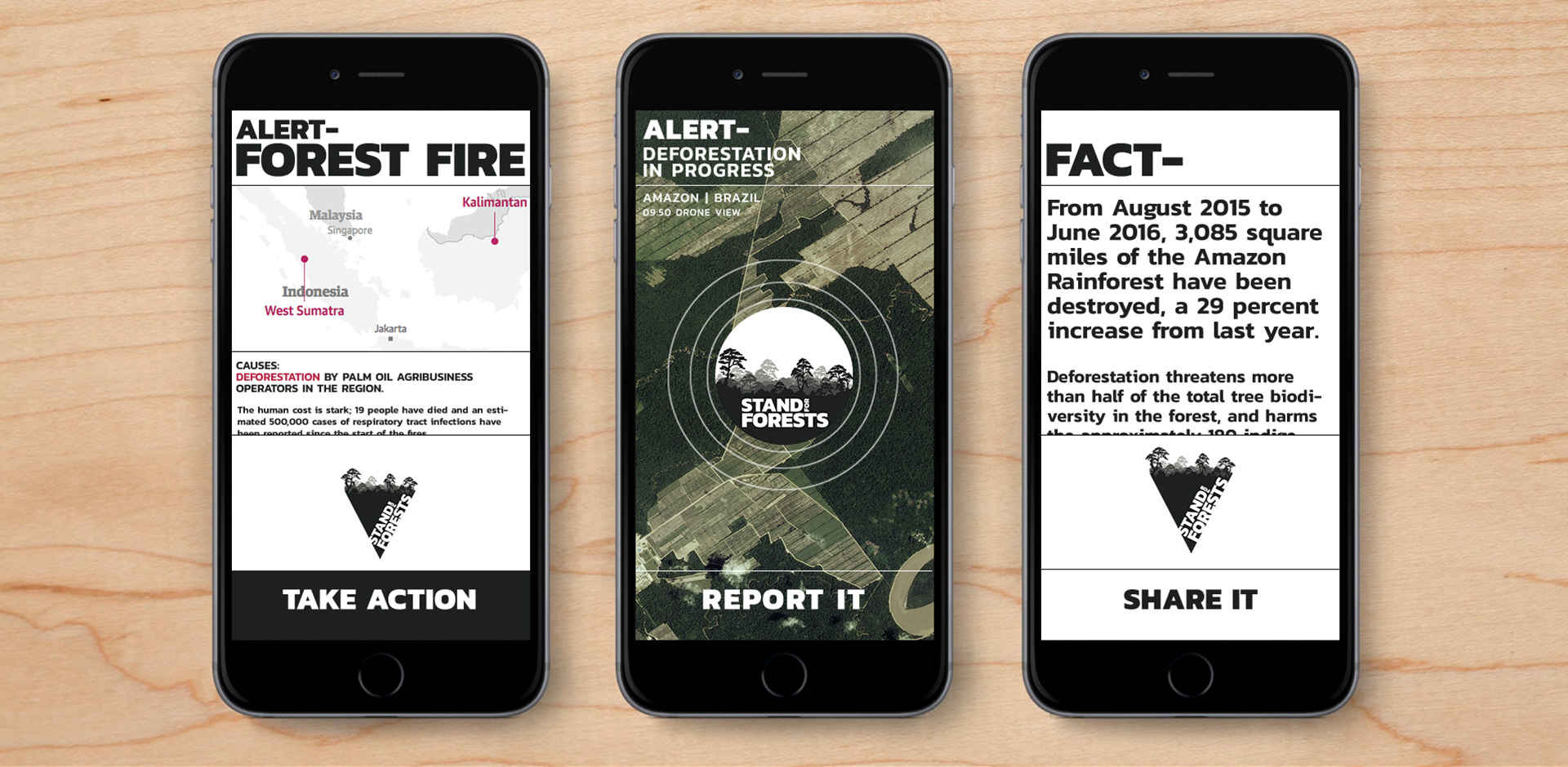
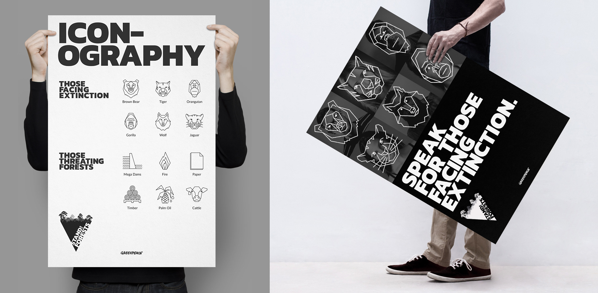
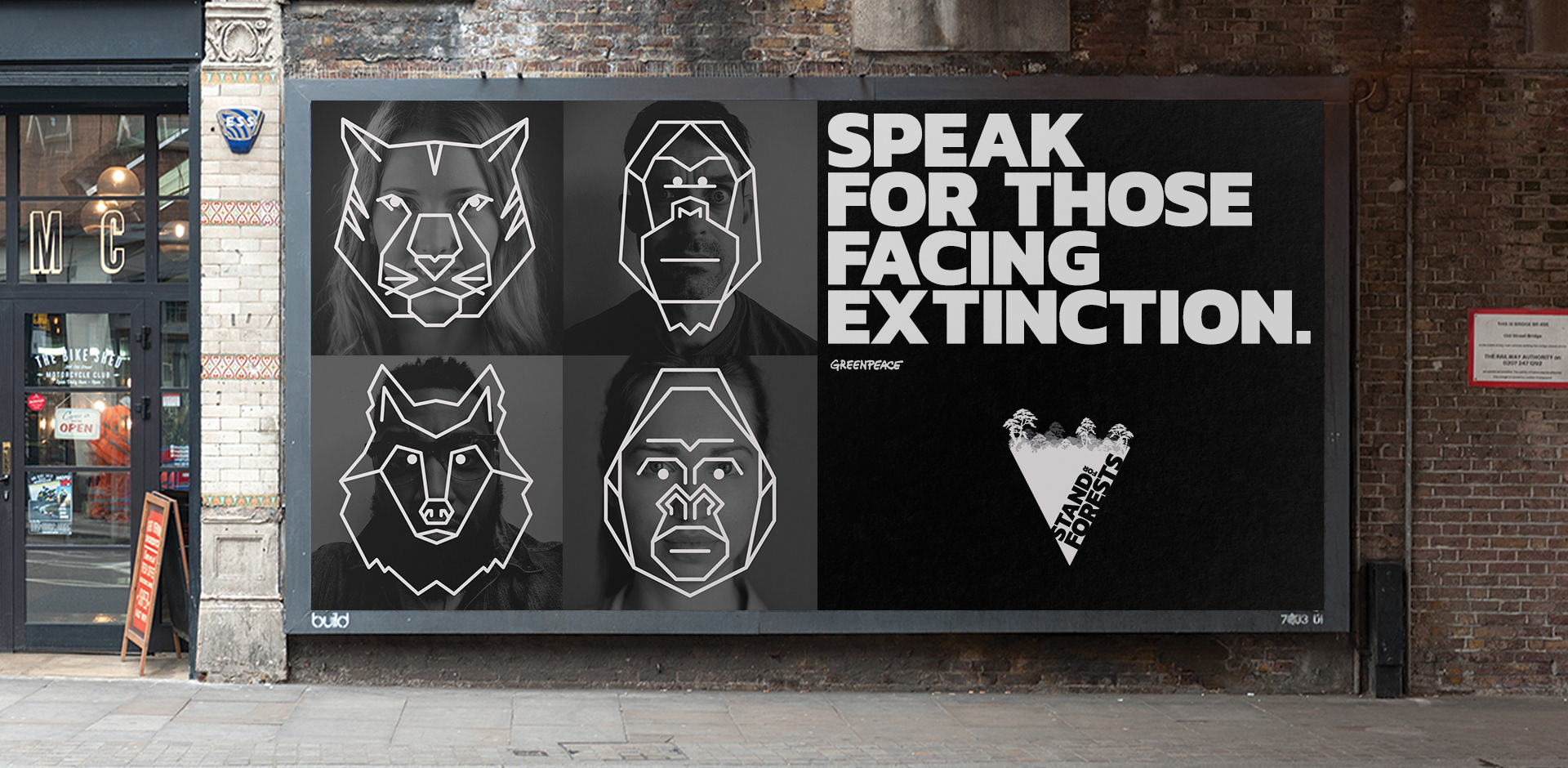
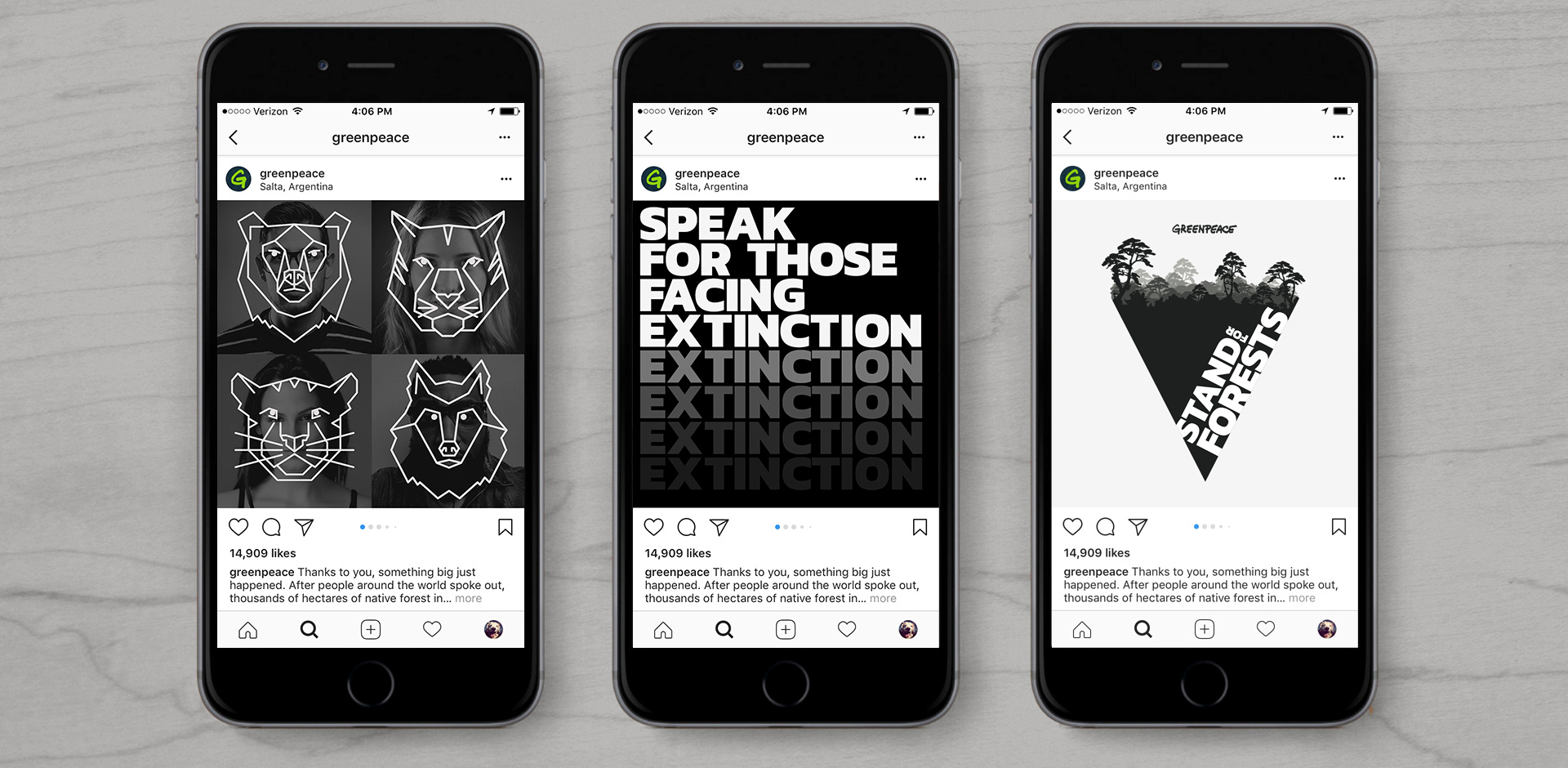
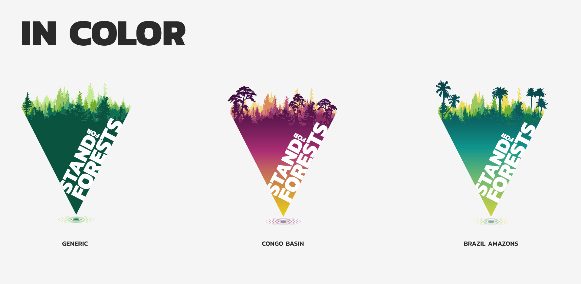
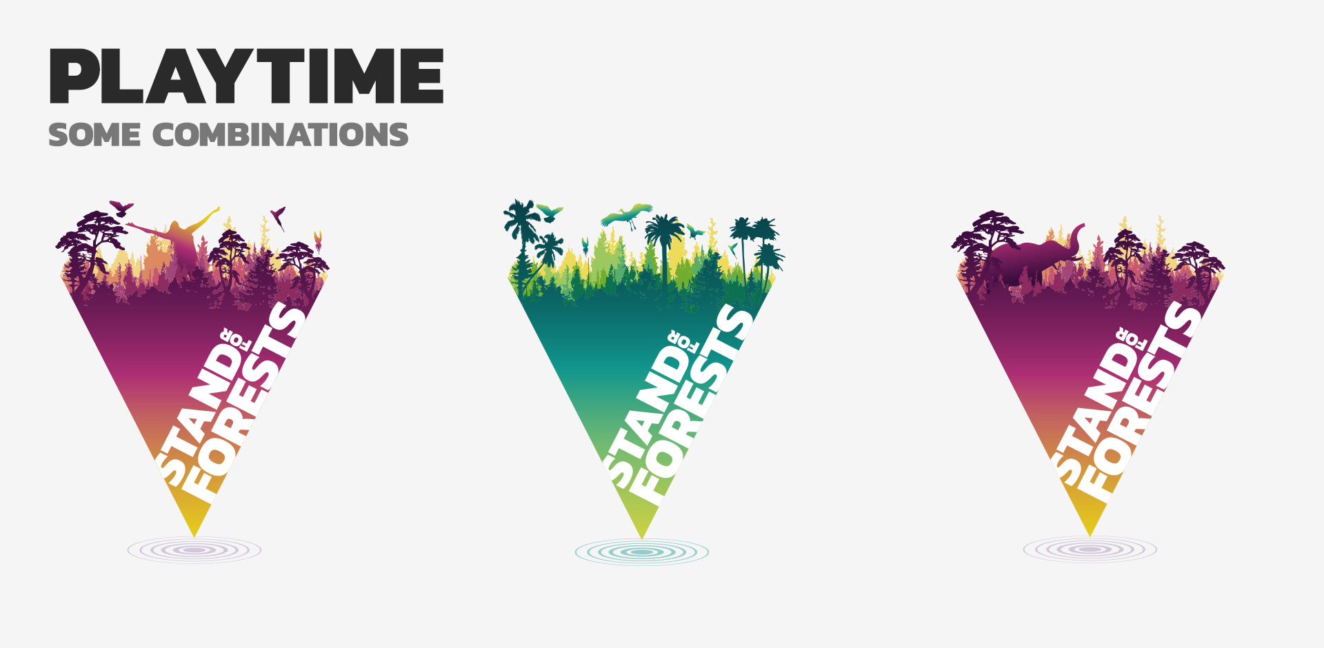
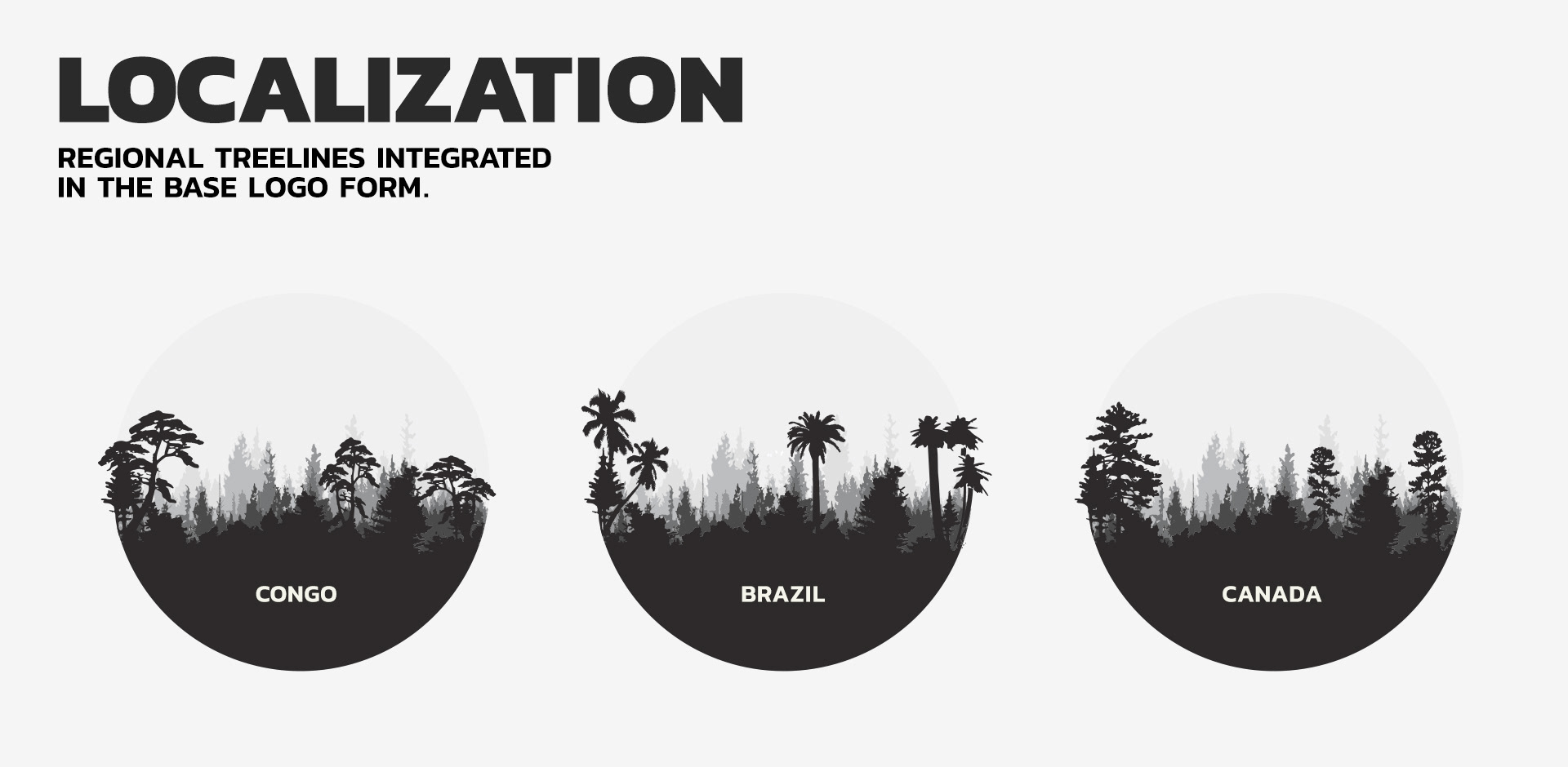
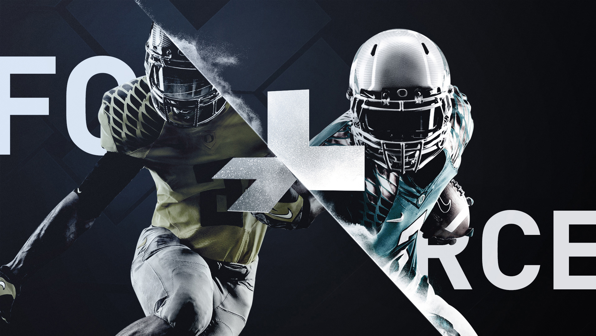
This was an interesting project for me. Greenpeace needed to bring all their forest campaigns under one roof. The idea was to arm and supply their appointed activists with a cohesive style guide in order to keep the message strong and united throughout all geographic regions and platforms whether it is print, digital or social media. One of the main concerns was that pushing a branding strategy and a style guide to various green peace offices around the world to follow was against the DNA of the Greenpeace movement. Rather they were looking more for an attitude, and ideas to have each region have their own touch while putting out their campaign materials hopefully with a unified attitude with the rest of the locations. One of the challenging task was to create an icon / logo that was adaptable to each region. In this case we had The Amazon, Brazil - Congo basin, Africa - Canada boreal and Indonesia. Each facing different issues and problems causing deforestation and loss of forests. Initially we thought we can start with the slogan (which later became Stand For Forest in English speaking regions) and carry that into a logotype form and color-code it based on regions.
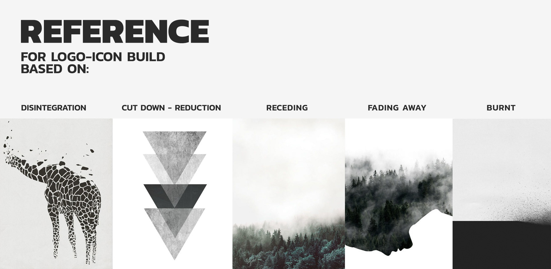
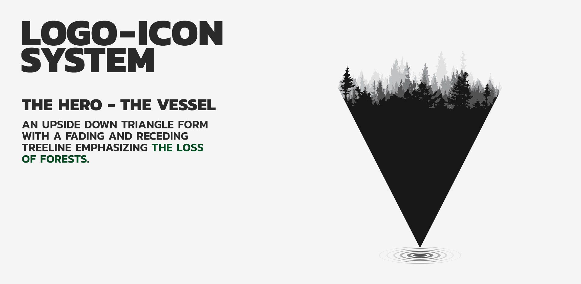
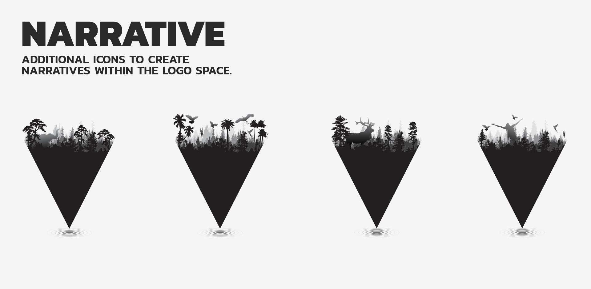
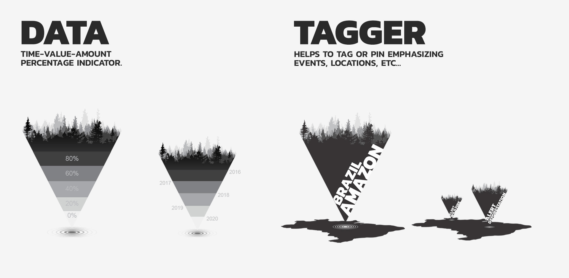
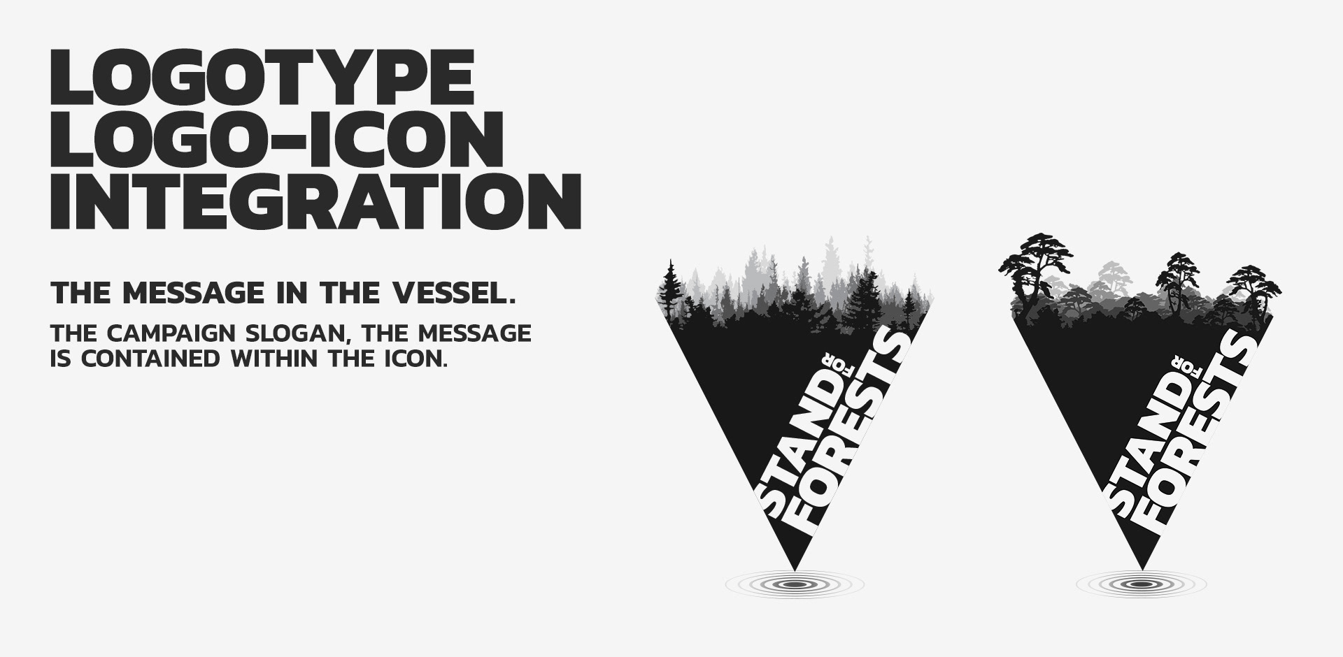
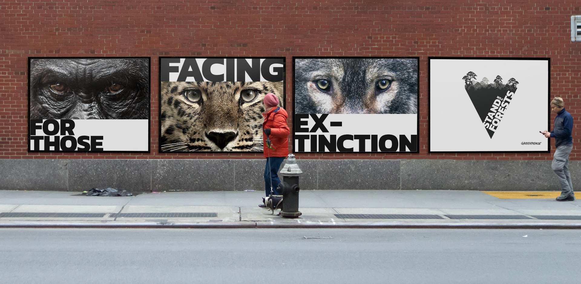
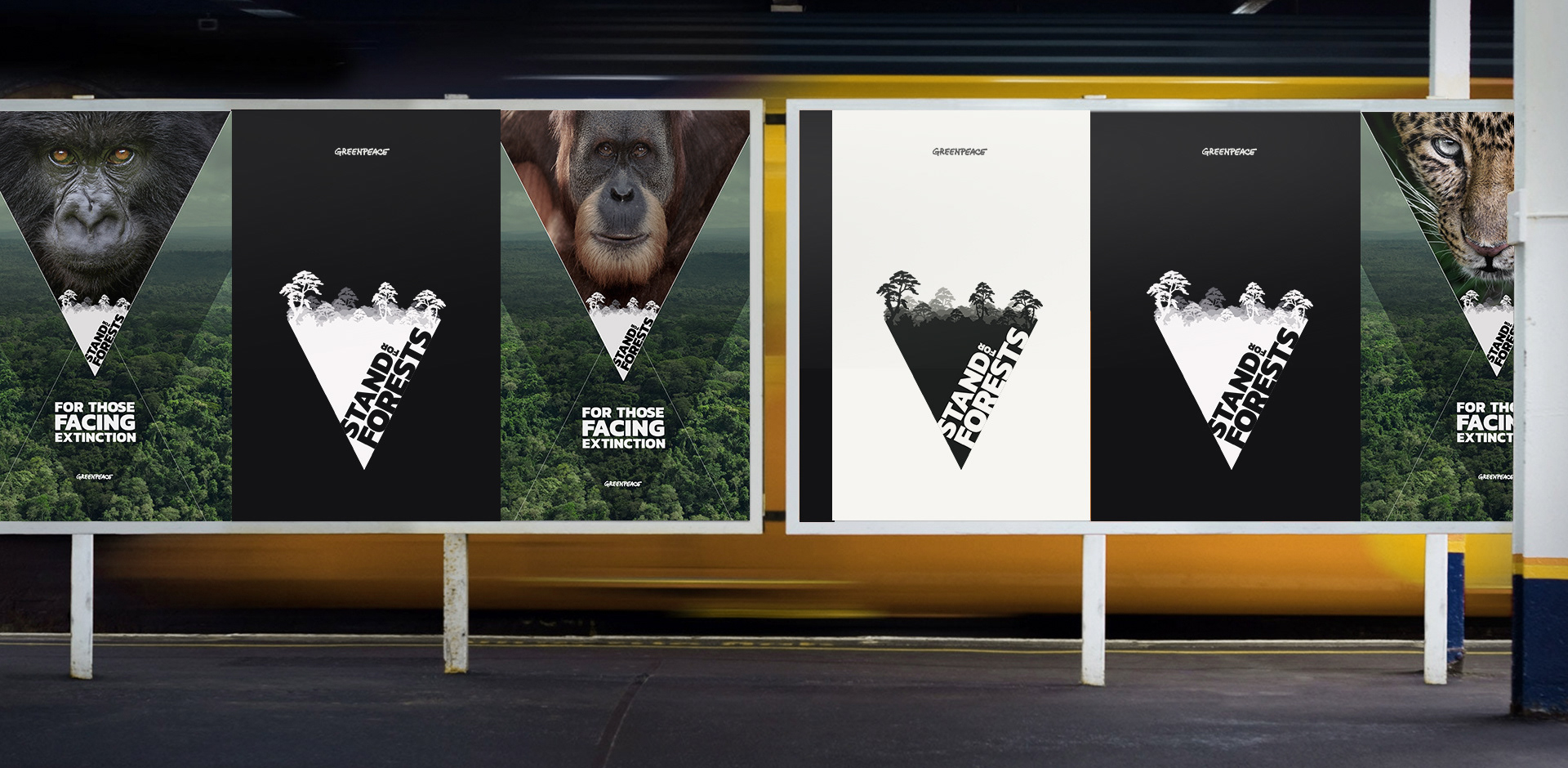
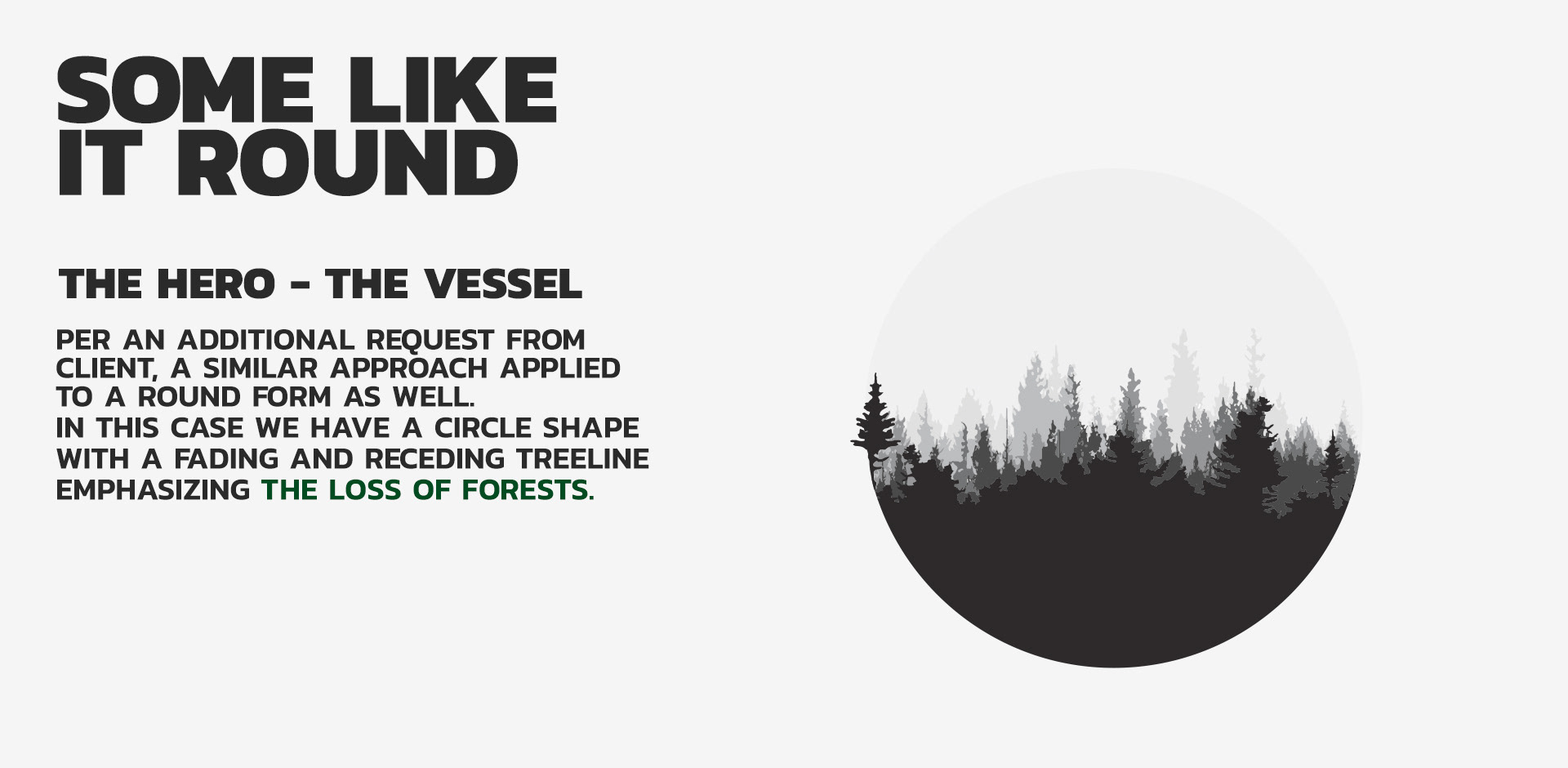
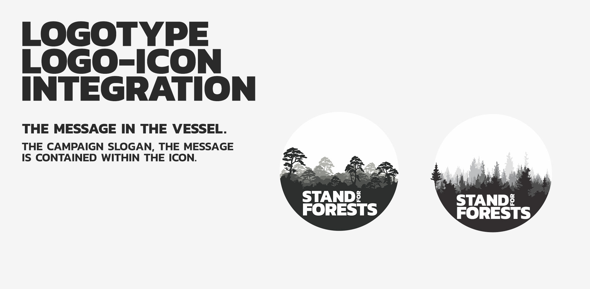
Later we realized the slogan was different in each country (based on language, meaning and issues) and could change throughout time since this was and still an ongoing campaign as long as deforestation continues throughout the planet. After these facts, we decided to create which I later called the vessel, an icon that could carry region specific details and the slogan whether in different languages or meanings. Hopefully could drive the style guide per region as well.
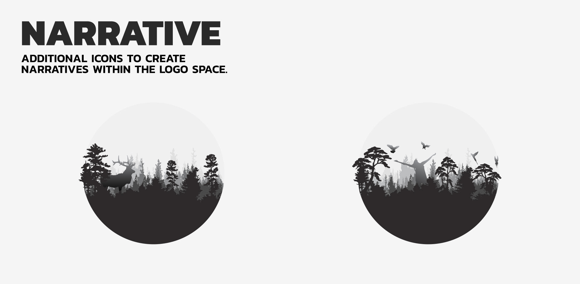
Greenpeace wanted something different than their other campaign icons and logos. More modern, impactful, attention grabbing, carries a message within, and timeless were some of the words surfacing to top of the list from them. Below you'll get a glimpse of the initial design process and ideas I put together while briefly consulting on the project. Incase you'd like to dive deeper into the campaign stories of these kind. There are really good reads by Asli Sonceley who was the project lead on this one and on quite few others with similar challenges. She is packed with experience and knowledge.
Here are some of her insights: